Data Insights: How to Build a Real-Time Dashboard with Python and Plotly
Introduction
Modern applications generate data every second — logs, metrics, API responses, and sensor readings.
To make sense of this data in real time, developers need interactive dashboards that can visualize insights as they happen.
In this post, we’ll explore how to build a real-time data dashboard using Python and Plotly Dash, a powerful framework for creating dynamic web-based visualizations — all in pure Python.
By the end, you’ll understand the workflow from setting up live data sources to rendering interactive graphs that update automatically.
Why Real-Time Dashboards Matter
Static reports are great for retrospective analysis, but real-time dashboards allow you to:
- Monitor systems live (e.g., server load, API uptime, IoT sensors).
- Visualize streaming analytics for decision-making.
- React immediately to anomalies or threshold breaches.
From DevOps teams to finance analysts, real-time dashboards turn data into actionable feedback loops.
Tech Stack Overview
Here’s what we’ll use:
| Tool | Purpose |
|---|---|
| Python | Core programming language |
| Plotly Dash | Web framework for interactive visual dashboards |
| Pandas | Data manipulation and analysis |
| Flask (built into Dash) | Backend server for hosting dashboard |
| Random / API Source | Simulated or live data stream |
Plotly Dash lets you write frontend and backend logic entirely in Python — no HTML, CSS, or JavaScript needed.
Setting Up the Environment
Install the required libraries:
pip install dash plotly pandas
Once installed, create a new file named app.py and start building your dashboard step by step.
Building the Base Dashboard
Start with a simple Dash app:
# app.py
from dash import Dash, html, dcc
import plotly.express as px
import pandas as pd

app = Dash(__name__)

app.layout = html.Div([
    html.H1("Real-Time Data Dashboard"),
    dcc.Graph(id="live-graph"),
    dcc.Interval(
        id="interval-component",
        interval=2000,  # Update every 2 seconds
        n_intervals=0
    )
])

if __name__ == "__main__":
    app.run_server(debug=True)
This creates the skeleton — a title, a graph placeholder, and a timer (dcc.Interval) that triggers updates every 2 seconds.
Adding Real-Time Updates
Now we’ll feed the graph with simulated live data using Dash callbacks:
from dash.dependencies import Input, Output
import random
import datetime

# Global dataframe to simulate live data
data = pd.DataFrame(columns=["Time", "Value"])

@app.callback(
    Output("live-graph", "figure"),
    Input("interval-component", "n_intervals")
)
def update_graph(n):
    global data
    new_row = {"Time": datetime.datetime.now(), "Value": random.randint(10, 100)}
    data = pd.concat([data, pd.DataFrame([new_row])]).tail(30)  # Keep latest 30 points

    fig = px.line(data, x="Time", y="Value", title="Live Value Stream", markers=True)
    fig.update_layout(uirevision="True")
    return fig
Each time the interval triggers, the function appends a new data point and updates the Plotly line chart — creating a smooth live graph.
Making It Interactive
You can enhance the dashboard by adding controls like dropdowns, sliders, or radio buttons to filter or customize data.
Example: Add a metric selector:
app.layout = html.Div([
    html.H1("Real-Time Metrics Dashboard"),
    dcc.Dropdown(
        id="metric-selector",
        options=[
            {"label": "Temperature", "value": "temp"},
            {"label": "Pressure", "value": "pressure"},
            {"label": "Humidity", "value": "humidity"}
        ],
        value="temp"
    ),
    dcc.Graph(id="live-graph"),
    dcc.Interval(id="interval-component", interval=3000, n_intervals=0)
])
Then modify your callback to generate random data based on the selected metric.
This makes your dashboard fully interactive — letting users explore data in real time.
Adding Styling and Layout
Dash supports built-in HTML and CSS styling.
Example: wrap your layout in a styled container:
app.layout = html.Div(style={'textAlign': 'center', 'fontFamily': 'sans-serif'}, children=[
    html.H1("🌡️ IoT Sensor Dashboard"),
    html.Div(id='status'),
    dcc.Graph(id='live-graph'),
    dcc.Interval(id='interval-component', interval=2000, n_intervals=0)
])
You can also integrate external CSS frameworks like Bootstrap for advanced styling:
app = Dash(__name__, external_stylesheets=["https://cdn.jsdelivr.net/npm/bootstrap@5.3.0/dist/css/bootstrap.min.css"])
Deploying Your Dashboard
Once satisfied, deploy your dashboard to a cloud service such as:
- Render, Railway, or Fly.io (simple Python hosting).
- AWS Elastic Beanstalk or Heroku for scaling production apps.
- Or host internally using Docker and Nginx for enterprise networks.
If you want to make your dashboard public, consider enabling authentication and rate limiting via Flask middleware.
Example Output
A running dashboard will display a live line chart updating every few seconds — reflecting your latest simulated (or API) data points.
You can extend this concept with:
- Multiple charts (temperature, pressure, humidity).
- Bar/area charts with Plotly Express.
- Real sensor or API integration (e.g., MQTT or WebSocket).
Python Code Example – Live Data Dashboard with Plotly Dash
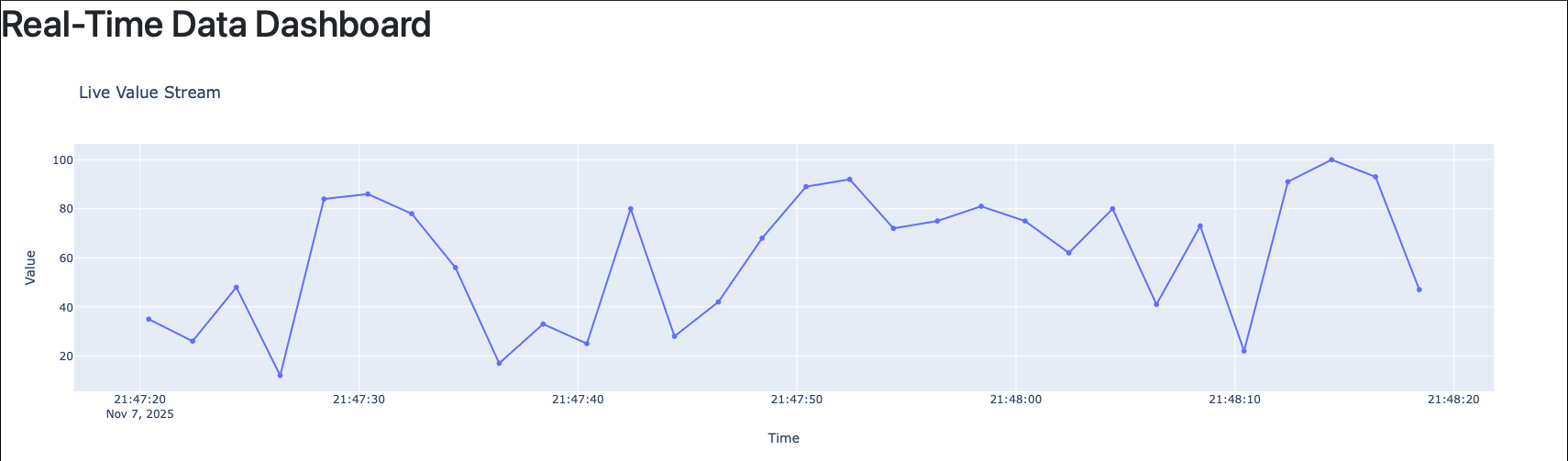
Figure: Sample Python code demonstrating how to build a real-time dashboard using Plotly Dash and Pandas. The callback function updates the graph dynamically every few seconds based on new incoming data..
Best Practices
- Avoid blocking calls — always use asynchronous APIs or separate threads for data ingestion.
- Limit data in memory — use .tail() to maintain a window of recent data.
- Cache static elements like titles and labels for faster performance.
- Test locally with debug=True, but disable it in production.
- Secure your deployment — hide internal endpoints, use HTTPS.
Conclusion
Plotly Dash makes it possible to build real-time dashboards in Python without writing JavaScript or managing frontend frameworks.
In just a few lines of code, you can visualize dynamic data, interact with it, and deploy the dashboard to production.
As organizations increasingly depend on live analytics — from IoT monitoring to financial systems — mastering tools like Dash allows developers to turn streaming data into instant insights.
References
Comments
Add Your Comment
Related Posts

Data Insights: Python in the Modern Data Stack – From ETL to AI Pipelines
0 45
Data Insights: Data Contracts – Fixing the Broken Data Pipeline Problem
0 61
Data Insights: Serverless Data Pipelines – AWS Lambda + S3 + Glue in Action
0 107AI Foundations Bundle — From AI Basics to Deep Learning & NLP
Learn AI the right way — from core concepts to deep learning and language models, all in one structured bundle.
Ideal for beginners and developers who want a complete AI roadmap without confusion.
No comments yet. Be the first to comment!