🧠 AI with Python - 📈 ROC Curve & AUC Score
Posted on: August 21, 2025
Description:
Visualizing ROC Curve with scikit-learn
Evaluating a classification model goes beyond accuracy and confusion matrices.
One of the most powerful tools is the ROC Curve (Receiver Operating Characteristic), which helps us understand how well a model distinguishes between classes across different thresholds.
What is the ROC Curve?
The ROC Curve plots the True Positive Rate (TPR) against the False Positive Rate (FPR) at various classification thresholds.
- TPR (Recall): Out of all actual positives, how many did the model correctly predict?
- FPR: Out of all actual negatives, how many were incorrectly predicted as positive?
An ideal model will have a curve that hugs the top-left corner, showing high TPR with low FPR.
Generating the ROC Curve
Scikit-learn provides an easy way to compute the FPR, TPR, and thresholds using the roc_curve function.
from sklearn.metrics import roc_curve

fpr, tpr, thresholds = roc_curve(y_test, y_proba[:, 1])
Here:
- y_test → True labels.
- y_proba[:, 1] → Predicted probability of the positive class.
Plotting the ROC Curve
Once we have FPR and TPR, we can visualize the curve using matplotlib.
import matplotlib.pyplot as plt

plt.plot(fpr, tpr, label="ROC Curve")
plt.plot([0, 1], [0, 1], linestyle="--", color="gray", label="Random Guess")
plt.xlabel("False Positive Rate")
plt.ylabel("True Positive Rate")
plt.title("ROC Curve")
plt.legend()
plt.show()
The diagonal line represents a random classifier. The closer the ROC curve is to the top-left, the better.
AUC – Summarizing the ROC Curve
The Area Under the Curve (AUC) condenses the ROC performance into a single number between 0 and 1.
- 1.0 = Perfect classifier
- 0.5 = Random guessing
from sklearn.metrics import roc_auc_score
auc = roc_auc_score(y_test, y_proba[:, 1])
print("AUC Score:", auc)
Sample Output
You should see a curve that rises above the diagonal line, with the AUC score printed in the console.
Example output:
AUC: 0.9956
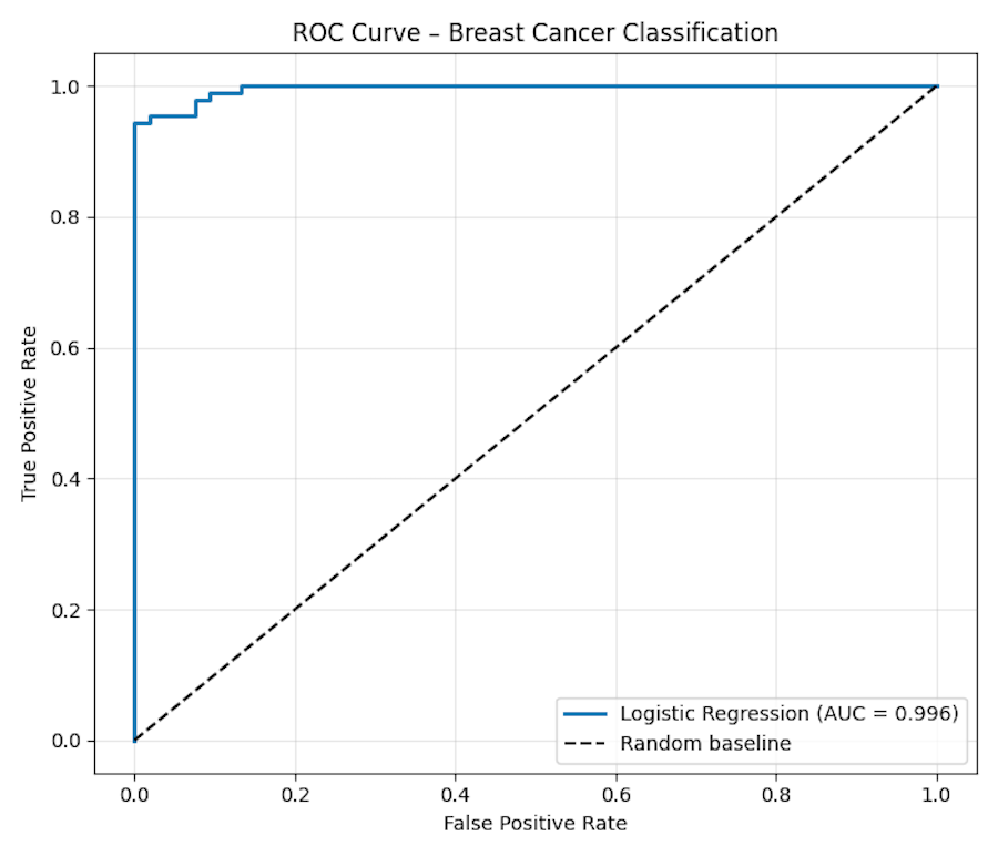
Figure: ROC Curve – Breast Cancer Classification
Why It Matters
- ROC Curve shows performance across thresholds, not just one fixed cut-off.
- AUC provides a single, interpretable metric of separability.
- Useful when dealing with imbalanced datasets, where accuracy alone is misleading.
Code Snippet:
# Import required libraries
from sklearn.datasets import load_breast_cancer
from sklearn.model_selection import train_test_split
from sklearn.linear_model import LogisticRegression
from sklearn.metrics import roc_curve, roc_auc_score
import matplotlib.pyplot as plt


data = load_breast_cancer()
X, y = data.data, data.target  # target: 0 = malignant, 1 = benign

X_train, X_test, y_train, y_test = train_test_split(
    X, y, test_size=0.25, random_state=42, stratify=y
)


model = LogisticRegression(max_iter=2000, random_state=42)
model.fit(X_train, y_train)

# Predicted probabilities for the positive class (label 1)
y_proba = model.predict_proba(X_test)[:, 1]


fpr, tpr, thresholds = roc_curve(y_test, y_proba)
auc = roc_auc_score(y_test, y_proba)
print("AUC:", round(auc, 4))


plt.figure(figsize=(7, 6))
plt.plot(fpr, tpr, label=f"Logistic Regression (AUC = {auc:.3f})", linewidth=2)
plt.plot([0, 1], [0, 1], 'k--', label="Random baseline")
plt.xlabel("False Positive Rate")
plt.ylabel("True Positive Rate")
plt.title("ROC Curve – Breast Cancer Classification")
plt.legend(loc="lower right")
plt.grid(alpha=0.3)
plt.tight_layout()
plt.show()


No comments yet. Be the first to comment!