🧠 AI with Python – 🐍🛍️📊 Clustering Customers using K-Means
Posted on: September 16, 2025
Description:
Customer segmentation is one of the most practical applications of machine learning. By grouping customers into clusters, businesses can better understand their audience, personalize marketing strategies, and improve customer experience.
In this post, we’ll use K-Means clustering to segment customers based on Annual Income and Spending Score.
Why K-Means for Customer Segmentation?
- Unsupervised learning → no labels needed.
- Simple yet powerful → works well for 2D and higher dimensions.
- Centroids represent the “center” of each group.
- Commonly used in retail, marketing, and recommendation systems.
Loading Customer Data
For demonstration, we’ll create a small synthetic dataset with two features:
import pandas as pd

data = {
    "CustomerID": range(1, 21),
    "AnnualIncome_k$": [15, 16, 17, 18, 20, 22, 25, 28, 30, 33, 60, 62, 65, 68, 70, 72, 75, 78, 80, 85],
    "SpendingScore":   [18, 20, 22, 25, 28, 30, 35, 40, 42, 45, 55, 58, 60, 62, 65, 66, 68, 70, 72, 75],
}
df = pd.DataFrame(data)
Standardizing Features
K-Means relies on distances. To ensure features contribute fairly, we standardize them.
from sklearn.preprocessing import StandardScaler

features = ["AnnualIncome_k$", "SpendingScore"]
X = df[features].values

scaler = StandardScaler()
X_scaled = scaler.fit_transform(X)
Applying K-Means
We cluster customers into 3 groups (k=3).
from sklearn.cluster import KMeans

kmeans = KMeans(n_clusters=3, n_init=10, random_state=42)
labels = kmeans.fit_predict(X_scaled)

df["Cluster"] = labels
Visualizing Clusters
We plot Annual Income vs Spending Score, color by cluster, and mark centroids.
import matplotlib.pyplot as plt
import numpy as np

centroids_orig = scaler.inverse_transform(kmeans.cluster_centers_)

colors = np.array(["#1f77b4", "#ff7f0e", "#2ca02c"])

plt.scatter(df["AnnualIncome_k$"], df["SpendingScore"], c=colors[df["Cluster"]], s=60, edgecolor="white")
plt.scatter(centroids_orig[:, 0], centroids_orig[:, 1], c="red", s=180, marker="X", edgecolor="black", label="Centroids")
plt.xlabel("Annual Income (k$)")
plt.ylabel("Spending Score (1–100)")
plt.title("Customer Segments via K-Means (k=3)")
plt.legend()
plt.show()
Sample Output
You’ll see a scatter plot where customers are grouped into 3 clusters, each with its centroid marked by a red “X”.
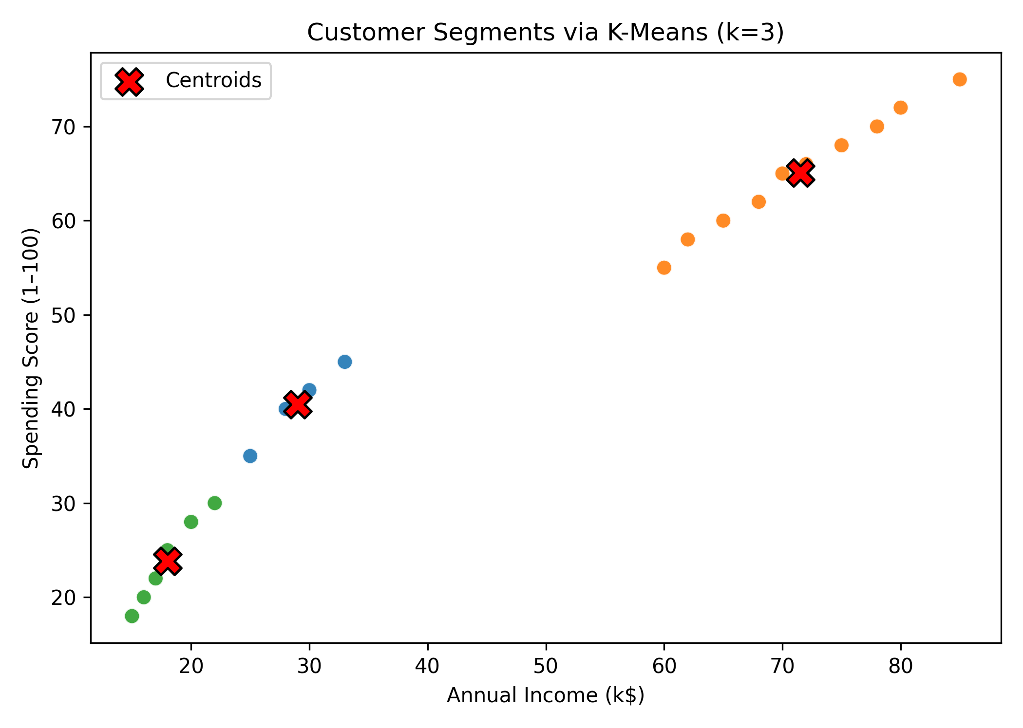
Figure: Customer Segments via K-Means.
Key Takeaways
- K-Means is a go-to algorithm for customer segmentation.
- Always scale features before clustering.
- Choosing the right k is crucial → use the Elbow Method or Silhouette Score.
- Works as a foundation before moving to advanced clustering (e.g., DBSCAN, hierarchical).
Code Snippet:
# Import core libraries
import pandas as pd
import numpy as np
import matplotlib.pyplot as plt

# Import preprocessing and model
from sklearn.preprocessing import StandardScaler
from sklearn.cluster import KMeans


# Create a small demo dataset (replace with your real data)
data = {
    "CustomerID": range(1, 21),
    "AnnualIncome_k$": [15, 16, 17, 18, 20, 22, 25, 28, 30, 33, 60, 62, 65, 68, 70, 72, 75, 78, 80, 85],
    "SpendingScore":   [18, 20, 22, 25, 28, 30, 35, 40, 42, 45, 55, 58, 60, 62, 65, 66, 68, 70, 72, 75],
}
df = pd.DataFrame(data)

# Peek at the data
df.head()


# Choose features for clustering
features = ["AnnualIncome_k$", "SpendingScore"]
X = df[features].values

# Standardize features (mean=0, std=1) to make distances comparable
scaler = StandardScaler()
X_scaled = scaler.fit_transform(X)


# Initialize KMeans: set k=3, use a fixed random_state for reproducibility
kmeans = KMeans(n_clusters=3, n_init=10, random_state=42)

# Fit on scaled data and predict cluster labels
labels = kmeans.fit_predict(X_scaled)

# Attach labels back to the original DataFrame
df["Cluster"] = labels

# Quick look at cluster counts
df["Cluster"].value_counts().sort_index()


# Inverse-transform centroids to original feature scale
centroids_scaled = kmeans.cluster_centers_              # (k, n_features) in scaled space
centroids_orig = scaler.inverse_transform(centroids_scaled)

# Put into a neat DataFrame
centers_df = pd.DataFrame(centroids_orig, columns=features)
centers_df.index.name = "Cluster"
centers_df


# Create a color map for up to 3 clusters
colors = np.array(["#1f77b4", "#ff7f0e", "#2ca02c"])  # blue, orange, green

plt.figure(figsize=(7, 5))

# Scatter plot of customers colored by cluster
plt.scatter(
    df["AnnualIncome_k$"], df["SpendingScore"],
    c=colors[df["Cluster"].values], s=60, edgecolor="white", linewidth=0.8, alpha=0.9
)

# Plot centroids (bigger, with black edge)
plt.scatter(
    centers_df["AnnualIncome_k$"], centers_df["SpendingScore"],
    c="red", s=180, marker="X", edgecolor="black", linewidth=1.2, label="Centroids"
)

plt.title("Customer Segments via K-Means (k=3)")
plt.xlabel("Annual Income (k$)")
plt.ylabel("Spending Score (1–100)")
plt.legend()
plt.tight_layout()
plt.show()


No comments yet. Be the first to comment!